Sunday, September 30, 2012

Art Gallery Visit

Which artworks make an impact or impression on me? Why?
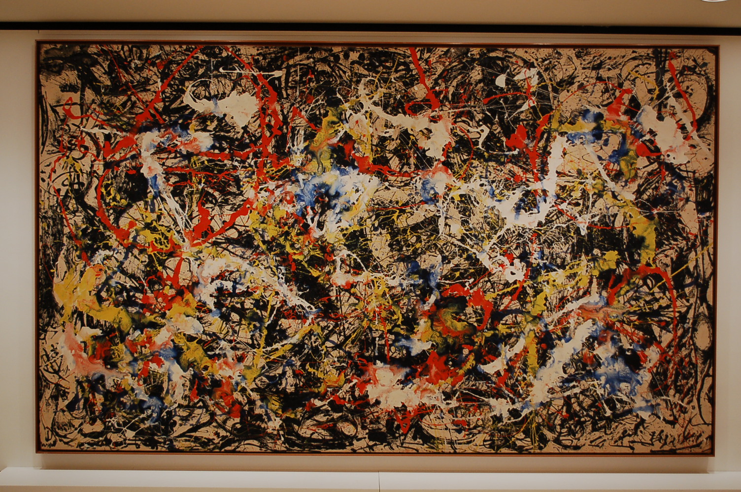
~Jackson Pollock, Convergence, 1952. This painting made from oil on canvas immediately made me stop and think how awesome it was! I love the arrangement of colors and how they all come together throughout the whole picture. This made me think of graffiti yet in a good way. An expression of feelings and uniqueness which expresses how I feel on a daily basis.

~James Rosenquist, Nomad, 1963. This artwork made of oil on canvas, plastic and wood represents so many different things. I immediately was drawn to it because of the colors used and the variety of objects displayed. This has an impact on my feeling of summer activities from the picnic table, to the bottle, food, ballet and a microphone.

Which artworks do I feel a connection with? Why?
~Reed Anderson, Midnight Peacock Music, 2006. This is the very first piece of artwork that I felt a connection with mainly due to the design and colors. The light blues and pinks made me stop and look at it a few times. This was made with acrylic on cut paper. The design is absolutely beautiful and the colors make it stand out. I think that the artist was inspired by his love for music and peacocks so he put them together to represent this. If you look throughout the painting, you will notice pictures within that truly demonstrate the title and meaning.


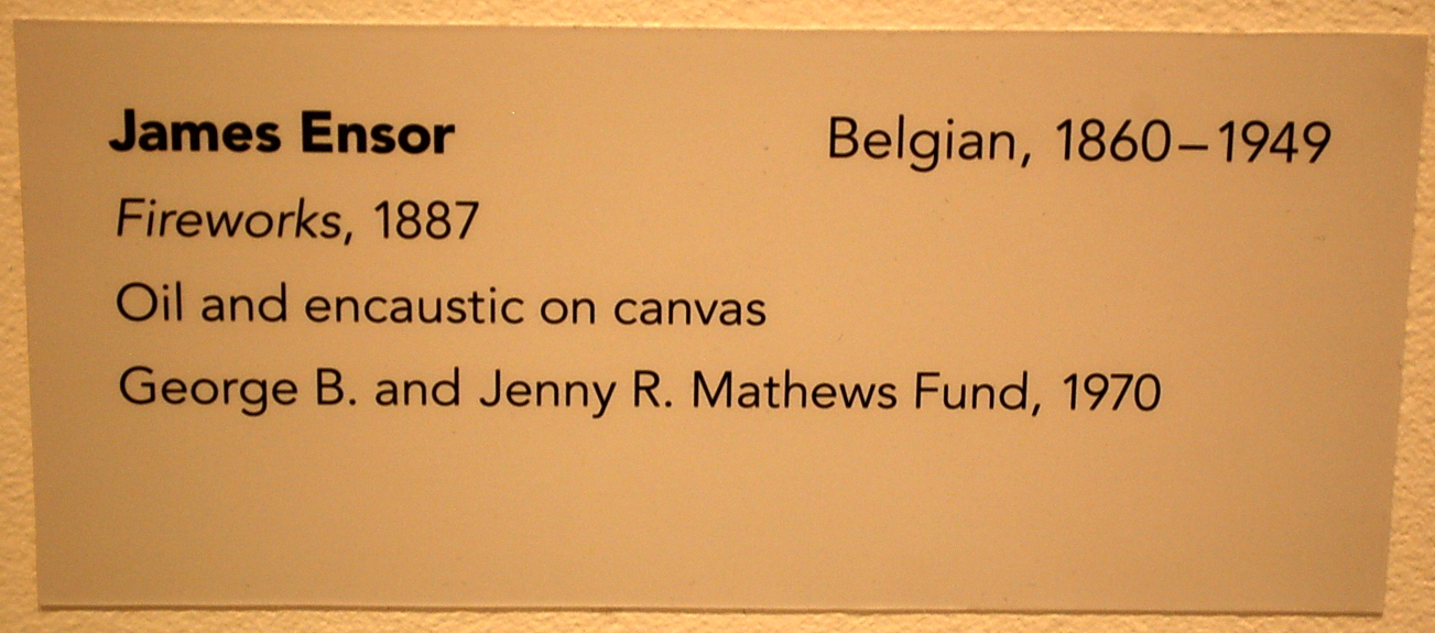
~James Ensor, Fireworks, 1887. This painting is made from oil and encaustic on canvas. I felt a connection because of the way it made me think of the Fourth of July festivities. One of my favorite things to do in the summer is to watch fireworks on the fourth. This painting represents a wide variety of color and thought.

Which artworks would I like to know more about? Why?
~Juan Gris, Le Canigou, 1921. This painting made of oil on canvas made me truly wonder what the artist was thinking, what inspired him and why he organized this the way he did. I see a guitar, door, book and other things that I cannot decipher what they are exactly. I want to know the connection between all the items in the painting.

~Jorge Pardo, Untitled, 2008. This artwork made of silkscreen on MDF struck my interest to learn more. I wonder why the artist shaped this the way he did, what inspired the design and three-dimensional design and why he chose to made it out of MDF board. The artwork literally jumped out at me and made me stand there wanting more information.

Saturday, September 29, 2012

Logo Design-Darkroom Studios


Discuss what you thought about creating your logo.
I thought initially about my passion for photography. Eventually, I hope to own my own business and this assignment helped me with potential ideas for the future. I wanted to create a logo that defined my imagination for photography.

Describe the process: creative thinking skills and ideas you used in the logo creation.
I researched websites that were available on Angel along with searching on Google to spark some ideas for my logo. I found that many artists represent their first and last names. I wanted to incorporate this yet use my initials in a different way. I put them in the middle of the lens of the camera that I drew, somewhat like a copyright to my work. I knew that the word darkroom had to be included one way or another and eventually came up with the name “darkroom studios.”

What was the most important discovery you made in the creation of your logo?
The most important discovery was the creative aspect of the project. I wanted this to be as unique and different, yet simple to represent myself as a photographer. It literally took me a few hours to come up with a creative name and logo. This assignment brought out some of my creative ideas which helped with the overall creation of my logo. If I could draw better, this would work to my benefit!

What is the most important information you learned from watching the videos, powerpoint, and reading material  for this project? What is your opinion of the videos?
By watching the videos, powerpoint and reading material, I realized that the most important information was that it takes time to create a logo, especially if you, as the artist, wants it to be special. I believe the more sketches drawn, the better the finished logo will be. The videos helped me to determine exactly what was necessary in developing my own logo. Time and effort are important factors when brainstorming a unique logo that will not only catch the attention of the viewers but create a lasting memory for all.

Saturday, September 22, 2012

Value Scale & Color Wheel

Discuss what you thought about creating the Value Scale and Color Wheel.

The value scale was quite difficult and took me many attempts to achieve the end result. I feel that it would take me a long time to actually master this skill because I would have to learn how to get down the right consistency This takes a lot of patience as well as a steady hand. The color wheel took me about just as long if not longer. I was finally able to master all the primary and secondary colors except the black. The consistency did not come out as planned.

Which media did you enjoy working with the best and why?

I enjoyed working with my camera because I am very familiar with how it is used. I was able to take a very clear picture of the color wheel and value scale that I created. I also believe that taking a clear picture of the work makes it stand out more that a scanned document.

What was the most important discovery in the creation of these studies?

The most important discovery in the creation of theses studies is patience and hard work. If one does not have the time and dedication towards the project, it would not look as good. When working on the value scale and color wheel, I noticed how intrigued I was doing so. I wanted to take my time and truly do the best that I could do.

What is the most important information you learned from watching the videos for this project? What is your opinion of the videos?

The most important information from the value scale video was the steps that were taken to creative it. The color wheel demonstrated a visual presentation in order to create primary and secondary colors. The videos helped me to understand what the actual task was and the detail that needs to be put into it. It is one thing to read directions but much more clear cut when watching a video. Both were education pieces that definitely put everything into perspective.

Sunday, September 16, 2012

Elements and Principles Project

Elements and Principles Slideshow

I feel as though I needed to create a theme for the Elements and Principles Slideshow. It is supported by images in downtown Buffalo, near the Marina. I wanted to capture pictures that had meaning behind all of them.  The photos are in order of the elements and principles of design. I found it quite interesting to have to focus on every photo I took. It made me feel like each photo truly had a purpose.

My slideshow starts off with forms which is shown by several cube-like stone shapes. I thought this was a great representation by the specific definition of its shape. Next is variety and I took this to show the many beautiful things surrounding the picture itself. Unity is represented by the next picture, a way of expressing the oneness of the lights. All are together in unison. Balance is shown by what I would describe as two plants at the same level. Line is represented by many different lines such as curvy, horizontal and vertical. One thing I absolutely love is the reflection of the sky and clouds in the window. This gives the picture a new meaning. It almost looks as though I am taking the picture from the inside out. Shape is represented by two buildings and a signal light. I took this purposely to show several different shapes. The glass building is giving off, yet again, a reflection of the sky and clouds. This shows the shape and form of them both. The more square building to the right shows lines and definition of shape. The signal light gives a round, curved shape. Space is demonstrated through a tree whose trunks are split in two. I immediately thought of the element and knew this would be a great example. Negative space is represented by the sky in the background. Color is shown through a variety of different colored flowers. The colors green, red, white, pink, purple and white give off a soft, peaceful mood. Movement is displayed by the American flag blowing in the wind. It is half staffed in remembrance of the ones lost recently. Texture is represented by the feel that the picture gives when looking at the "bullet" holes. It looks as though they are three dimensional and literally popping out giving off a round, hard feeling. Repetition is shown with the railing and the way the bars keep repeating themselves. It also shows lines and depth of field. Pattern is a picture of the brick walkway along the marina. I thought it showed definition of what a specific pattern should be. The curvy bricks are a great example of this principle of design. I took the picture of the lighthouse, water and clouds to represent emphasis. When I look at the picture, my eyes immediately are drawn to the lighthouse. Finally, proportion is represented by the unity that is displayed through the sky, sunset, waves and beach. All are in proportion with each other.

Downtown Buffalo gave off a great vibe and I am very happy with my photography assignment. I hope everyone enjoys my unique slideshow of all my beautiful photos!

Saturday, September 15, 2012

Color Theory and Emotional Effects

Describe Color and it's effects on emotions. Use the appropriate vocabulary of color in your posting.
Color is very important aspect in this video. June visits Venice, Italy to become inspired to paint a painting that displays overall well-being. When visiting she finds a peculiar spot and drafts her painting using the specific colors of the space. When back in her art studio, she begins to paint. Difficulties arise leaving it difficult for her to finish. She then had to revisit Venice in her mind to get the feeling back entirely; the reason for the painting. The colors truly affected the overall result of her beautiful painting but is eventually is pleased with the finished result. June showed how colors can effect emotions and feelings in a different way than people might expect.

What is a theoretical aspect of color that most intrigues/fascinates you? Why?
The warmth in colors have always fascinated me because they truly play with my emotions. The painting throughout the film, Color, made me look further and understand the meaning of specific pigments. History takes us back and explains where we are today in reference to the creation of colors. It is amazing to think about how past artists impact the future artists of tomorrow.

In the Color video, what made the biggest impact on you in regards to color and it's effects on emotions?
There may be several things that impact color and its effects on emotions. I believe that the biggest is the feeling an artist has when they become inspired especially when it leaves the viewer with the same impression. June made me realize that there is more to a painting that one may actually think. The specific spot she chose in Venice did not seem like much to me until I saw her finished painting and compared it to the “live picture.” June displays a very relaxed mood of bright, warm colors. She emotionally shows this in her painting and describes to the camera man the impact of every color used.

In the Feelings video, what made the biggest impact on you in regards to color and it's effects on emotions?
My biggest impact was the way Jacques-Louis David showed his emotions in his paintings. He painted with very bright, vivid colors majority of the time even if the mood was on the violent side. David expressed every possible meaning that included paintings that were cruel and frightening. All of them had a purpose relating to the different experiences he encountered at the time. David’s emotions and feelings were displayed from the simple colors he used to the true meaning of the art work. The paintings shown in the video, especially "Death of Marat", were somewhat controversial. They always left an impression on the viewer.


Saturday, September 8, 2012

Aesthetics

For each video list/discuss the key concepts you learned.
The CARTA video had two different perspectives that were both interesting in many ways.
-I learned that art evolves from the brain and is determined by how it truly functions.
-Emotions, feelings and consciousness are affected when determining art and aesthetics. Art is something more than what we make of it. The meaning is broad.
-There is science in art but it is how we perceive it that makes it important to the viewer and artist. Art is by far influenced by culture and is universal.
-Art is important to every person who experiences and expresses it.
The Aesthetics video is based on artists who influenced the philosophy of art.
-This speaks of the history of several different philosophers. All of which have their own view and importance on aesthetics.
-Beauty is portrayed in art and explains that they are completely different from each other.
-”Human beings have a sense of beauty in harmony.”
-Even if something is not beautiful, it can be beautified.
-Plato influenced other philosophers to expand on his ideas and make them their own.

Which philosopher's theory on aesthetics do you feel is most important? Be sure to mention the philosophers name, era (time in history), and contribution to the aesthetic theory in your response.
The philosopher whose theory on aesthetics is most important is Plato, 4th Century B.C. He speaks of beauty as significant to any work of art. Aesthetics can be described as beauty in harmony. Perfections are attracted to the idea that it is contemplated and not always taken seriously. The art work often confuses people into thinking that the subject matter is fake. It is presented and suited for anything. All of which are very important to know the meaning behind any and all works of art. The video describes Plato as having an active treason against the “idea.”It is how we perceive the art and display the actual thought processes.

What do you think about Changeux and Ramachandran scientific view of aesthetics and art? What was the most interesting fact you discovered from each speakers lecture?
Changeux focused more on his presentation from his computer slideshow. He explained the scientific structures by showing images of the brain’s thought processes and related them to the definitions of several terms that are proven to be art and aesthetics. Changeux explained the discovery of tools, symmetry, symbolism and artistic composition. All of which are important to his speech. The most interesting fact that he spoke of was when he simply said that “art makes us aware.” I believe that this is one hundred percent true in all aspects of art and especially aesthetics. An artists conception of the world is displayed in a single piece of art.When we are “aware” this means that we are interested and want to learn or understand what is in front of us.
Ramanchandron’s scientific view is more visual and too the point. He demonstrates a lot of visual images that are used as examples in his speech. This helps to understand the messages that he is trying to display to his listeners. Also, Ramanchandron demonstrated great stage presence and sense of humor that made everything he said more interesting especially when he explained the eight laws of aesthetics. Each law is universal to every culture. Seeing is believing. Ramanchandron showed many images/statues that highly related to his lecture’s meaning. He made his presentation vivid!

How do the videos relate to the readings in the text?
The videos give a more visual aspect to the readings in the text. They relate by how history is explained and the importance of aesthetics in art. The videos and the text coincide with each other with a sense of unity and understanding. Both display beauty’s significance in art and how this can sometimes be used against specific artists.

What is your opinion of the films? How do they add depth to understanding of the topics in your reading?
I believe that the films are interesting in different ways. The Aesthetics video focuses on philosophers history of art and the way it was portrayed back in time. The CARTA video depicts the science of the brain and relates it to art and aesthetics importance. The videos add depth to the understanding of the topics of the reading because they support views and show another way of how to visualize meanings and facts. Some students may think that the video portrays a more interesting approach to the material in the text. I believe that the more spontaneous a speaker intends to be will help the listeners understand the message being taught. I guess it depends on the person and why they choose their preferred method to learning.